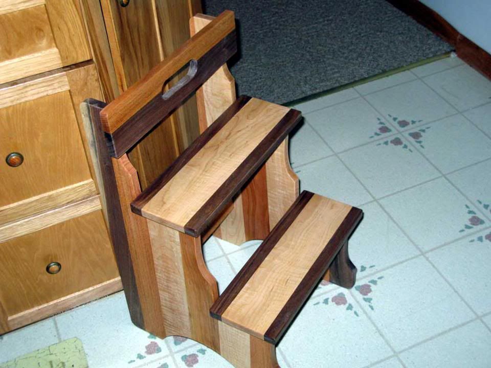
A rainbow step stool I made. It is supposed to look fun to kids. Walnut, cherry, maple.
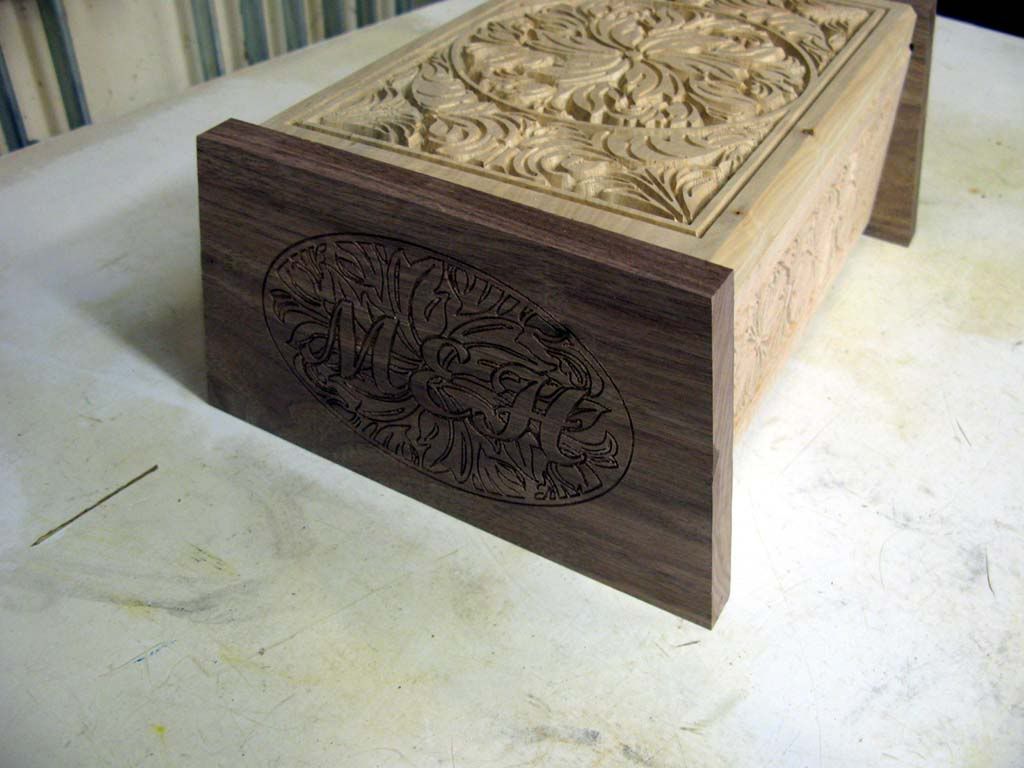
A keepsake box for my daughter - Walnut and maple.
I like to just play around on some projects. I am not trying to end up in an art gallery anyway.


 Member
A rainbow step stool I made. It is supposed to look fun to kids. Walnut, cherry, maple.
A keepsake box for my daughter - Walnut and maple.
I like to just play around on some projects. I am not trying to end up in an art gallery anyway.
Glad its my shop I am responsible for - I only have to make me happy.
Member
Honestly I've never had a burning desire to use purpleheart on anything, but if I did I'd match it with something yellow or red. Purple and yellow make one of the most pleasing color combinations, so go bold IMO. I've worked with yellowheart (no idea if that's the right name) and I just got introduced to osage orange tonight. Maybe some Kauri if you want to go really exotic.
Contributor
Douglas:
My opinion is that it's often not about the specific choice of wood but rather the choice of contrast in the first place. For me, and this is just me and my style, I do nothing whatsoever without purpose. There's no line, no carving, no rounding over, no color, no contrast, no knob, no screw, no curve, no anything without a definite purpose. Again, that's just my style. Now, that's not to say that I don't do things strictly for aesthetic reasons, but it's a definite aesthetic reason. "Contrast" is not a good reason for me. Accenting a particular line or feature is a good reason. Contrast is my tool.
I'm not classically trained, I haven't studied design, and I'm a terrible artist by any definition of the word, but the pieces that draw my eye are the pieces where every element exists only because it serves a purpose. The pieces I don't particularly like are the ones that are overly complex with no obvious purpose. I can appreciate them, and I can certainly admire the skill and talent that goes into creating such a piece...sometimes a masterpiece, even. They just don't speak to me the way a simple and spartan piece does, or the way a tastefully done piece of marquetry, for example, does. There's a fine line between being so plain and stark as to be jarring and so complex as to be distracting. Somewhere in the middle lays purposeful artistry that breaks up a slab of wood, but only just barely.
Again, this is all just my opinion, but in my opinion if there's an element that could use highlighting, it hardly matters what the choice of contrasting wood is. No matter what you choose, there will be a setting where it will look nice and be appropriate. If you choose bright colors, maybe a modern setting will work. If you choose contrasting earth tones, maybe it's at home in front of a fireplace in the study. I think the key is using color to actually highlight something of significance and doing it tastefully. Too often, I see what looks to me like clown furniture. It's not that it's poorly executed, as much of it is masterfully done, but just that there's no obvious rhyme or reason to the particular scheme....it's like some designer somewhere decided that he needed some color, and then went off and randomly added a stripe here and a lamination there.
Anyhow, that's my opinion. If it looks good to your eye, then it's good, so long as you're honest with yourself that you actually like it as opposed to doing it because you think it's different or interesting, and then convincing yourself that because it's different and interesting that it's also good. I do that all the time. I come up with wood combinations that are bold and exciting....and then I step back and look at it and have to face that it's really an awful combination that has no redeeming qualities other than the exotic and expensive sounding wood names.
Contributor
For those that are subscribers the article can be found below. If you are not a subscriber. Then what are you waiting for? You will not regret it. I think it is the best woodworking mag out there. That is besides Woodwork. But that mag seems to be dying a slow death for some unknown reason. Perhaps the content is of such a high quality it is just to expensive to produce?
http://www.finewoodworking.com/Skill....aspx?id=33285
In defense of Garrett. It is possible that he did not chose the tittle. He also states "at least not in this piece." in regrade to the purple hart and maple combination.
"Purple is an uncommon wood color that’s too
different from the golden-blond tones of maple, at
least on this piece."
Does anyone else have a suggestion for a domestic species to pair with oak? One poster has already suggested black walnut and the article suggests ash.
James
Contributor
The maple and Walnut in that stool look superb...the Cherry complicates the contrast IMO....but very well done, I applaud your efforts to experiment.
This subject of contrasting woods comes up on many ww forums...and IMO, its one of the few ww issues NOT beat to death... I have never seen good reference books showing examples of what works, what does not work, etc. And the issue raised above, woods changing colors is an important consideration.
I fully agree with above poster.... I have seen lots of projects nearly ruined by a gorgeous veneer, over-done. While it might have looked gorgeous as an accent piece, it can not take on the entire project, as it simply overwhelms the appearance, to the point of confusion. Of course, when you realize how much work went into the piece, its hard to say negative things to a fellow ww. I wish more people would post pix like the stool example above, this is one area where seeing is believing.
I keep waiting to see more contrasting woods for kitchen cabinets, but it never happens. I find the raised panel and frame with same wood, so 1980's already, its boring, stuck in a time warp.... hard to fathom why there is not more progressive designs in cabinets....
 Member
Interesting read. I think you have to visualize and think about how many doors, kitchens cabinets, fine furniture, that have different colors of rails & styles. I think the panels are to large to support another species/color wood. However if it were a craft clock, or a keepsake box, those colors would jive, only b/c it would be smaller. Carl
Contributor
You might be right Carl.... maybe there is a good reason for the "same ol"....
but I would think, even a different cut of the same wood for noticeable different grain, or darker lighter stain on the rails to set them off from panel would be more eye catching, vs. the entire piece looking as if its pressed from a single piece of wood (slight exaggeration to make a point)
Contributor
I used to travel to Barcelona a lot. Some of this Gaudi architecture I loved. Some I thought was terrible.
http://www.google.com/search?q=gaudi...w=1312&bih=656
Its pretty safe to say this guy broke a lot of traditional rules. (I have heard that of Frank Lloyd Wright as well - especially 'structural' rules that were broken). But the fact that these guys did this has added to the design world.
At the same time - my own eye for design is very 'early in its development' lets saySo I do benefit from guidance/rules of thumb (and I very well may choose to ignore these rules of thumb sometimes). I do have a tendency to use contrasting woods - and have even stained some pieces just for this effect. So I like to learn what works as generally pleasing, and at the same time I appreciate those that have broken the rules.
The obvious - what is pleasing to me may not be pleasing to someone else. What is pleasing to Garret Hack might not be pleasing to me.
I especially find differences in what is pleasing as you look across different cultures. There are real cultural differences in preference. (for example in Japan they might prefer harmony and blended tones, where as a Caribbean culture might like bright, bold contrasts). These stylistic differences affect how the viewer FEELS when they view the object (and oft times, art is about translation of feelings). A person with a particular background and environment and culture is likely to have an expectation of a certain way - if you deviate substantially from these the person may not get the same enjoyment of feeling about it. (ie, its not comfortable or just doesnt feel right - but to someone else it may bring comfort).
So net net is, its kinda like telling women the 'right' way to do makeup..... good luck with that.
Member
I think that a large part of the issue is that this choice falls into the realm of art, not woodworking per se. And in art one must judge each piece by the impression it creates, not by some absolute standard or rule. Furthermore, the judge is the person who ends up owning the work; all that matters is that person's opinion.
That said, unless you just want to express your inner artist by building a piece on spec and seeing afterward whether anyone will buy it or put it in their house, you need to stick to things that the majority of people seem to like. Alas, this changes with time (consider: what would someone from the era of Chippendale or Sheraton think of the current fad of "clean" slab-fronted Euro-style cabinets?). Hack provides some general guidance based on his impression of what most of us currently like, which is valuable to us color-blind, tone-deaf, tommy-ten-thumbs types!
Personally, I would use purpleheart only for a deliberate accent. Starting from that premise, visual impact is already part of the design, and contrast with adjacent wood would be part of the art.
Member
Tom hit on something I believe also....it's not so much about what woods go with what other woods....it's about good design. Good design follows certain principles and as mentioned already, creates a look generally pleasing to the eye.
Sure any rule can be broken....but it tends to work out better when one understands why the rule is there in the first place
I see work that I would consider bad design all the time. There is this belief by those who don't know any better, that if they just use really exotic woods, or woods with figure, or burls, their pieces are going to be so fantastic that everyone will oooh and ahhh, and the sad thing is it's true! I watched a guy build a chest of drawers using curly maple for the fronts. The chest was poorly built at best, the proportions were a bit out of whack, and the way the drawers operated was iffy at best. It was on display and people would stop and remark on it all day long, why....b/c of the curly maple!
At the end of the day if the person who owns it is happy with it then it really doesn't matter. I've had pieces I built early on that over time I grew to dislike. I've given several pieces away to friends and family who were excited to have them. I'm not going to tell them they shouldn't like them for the various reasons I have. So if you like maple with purple heart don't let anyone tell you different....I didn't see the pic, but I don't think generally speaking they're a bad match? If you like to plaster your shaker style cabinets with burls and figured woods go nuts. I have a friend who thinks his oversized flat slab curly maple towel closet doors in his split level house are fabulous....and I'm not going to tell him any different
good luck,
jeffD
 Posting Permissions

 Reply With Quote
")