Results 1 to 13 of 13

Thread: Back in Blue

  1. #1

    Back in Blue

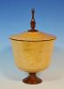
    I have done several of these forms in various colors, one of my favorites being blue. Unfortunately, my technique still needed some refining. Some of those earlier pieces don't really hold up to the the kind of close inspection turned work is often subjected to. It's not that they are poorly made, just that there are some imperfections, little bits of tear out, finish blemishes and such that I'm not happy with. So I decided to go back and revisit a couple of things and the first is this blue one. I have been stoked on the blue dye ever since I slapped it on that little maple burl HF. I love the marble like quality that appears when the dye is sanded back.

    back_in_blue_1.jpg
    David DeCristoforo

  2. #2
    Join Date
    Mar 2007
    Location
    Eureka, Mo.
    Posts
    2,363
    Prettiest one yet! I drawn to the marble like quality of this too.

  3. #3
    David, I love blue on maple burl - it is so striking! This piece seems to have a little higher "flare" than some of the others - I think I like this look even better than the others. Beautiful work - very beautiful!! This is exhibition quality work, David!

  4. #4
    "This piece seems to have a little higher "flare"..."

    Not an illusion! I have tried to stay close to the "golden mean" with the relationship between the height of the "bulb" and that of the "bell". But I keep wondering how it would work with the two elements being closer to equal in height. I have so many variations to play with that I am certain everyone will get bored with these long before I do!
    David DeCristoforo

  5. very nice indeed........you hit on winner with that color scheme.
    Remember, in a moments time, everything can change!

    Vision - not just seeing what is, but seeing what can be!


  6. #6
    Join Date
    Oct 2006
    Location
    Harvey, Michigan
    Posts
    20,804
    Beautiful work for sure David!! Love the natural edge on this one!! Looks like it would be right at home in a gallery somewhere - with task lighting showing off the blue marble effect!
    Steve

    “You never know what you got til it's gone!”
    Please don’t let that happen!
    Become a financial Contributor today!

  7. #7
    Join Date
    Mar 2008
    Location
    Spring City, TN
    Posts
    1,537
    David, Beautiful job, I really like this one.

  8. #8
    Join Date
    Aug 2010
    Location
    Wittmann, AZ
    Posts
    2,503
    Stunning piece David! I really like the dye job on this one!
    "If it is wood, I will turn it."
    vor-tex: any activity, situation, or way of life regarded as irresistibly engulfing.

  9. #9
    Join Date
    Nov 2008
    Location
    Negaunee Michigan in the Upper Peninsula
    Posts
    607
    An absolute beauty, especially with the grain of the burl showing through. I like it better than your prize winning beauty. Congratulations by the way. That entry in the B&B contest was also exquisite.

  10. #10
    Awesome! Love the color.

  11. #11
    Join Date
    Jan 2009
    Location
    sLower Delaware
    Posts
    5,464
    Great color! Have to say the marbling look adds a lot! The larger flare is an interesting variation.

  12. #12
    Join Date
    Sep 2009
    Location
    Blairsville GA
    Posts
    2,105
    David,
    Beautiful redo. I like the taller flare, it really lightens the piece. I'd say you have your dye work down quite well. Nothing not to like about this.
    By the way, I looked at your site and it's cool seeing the whole series of amphora and other shapes you've played with over the past year or so.
    Laugh at least once daily, even if at yourself!

  13. #13
    David,

    As usual very nice. Well Done.

    Alan

Posting Permissions

  • You may not post new threads
  • You may not post replies
  • You may not post attachments
  • You may not edit your posts
  •